
Comp. #1
I wanted to write the letters where they look like buildings. The one on the far left is perfectly straight to show that it is stable and strong, BUT not for long. The reason being is because when you look at the right side, you can see that the other two buildings of text are about to collide against it. For this comp, I really wanted to capture just that feeling of motion in seeing the buildings fall against each other just like dominoes.

Comp #2
My aim was to create a circle of text while boldening the words that are the cause of the problem. The reason for the circle was because Japan's flag is one dot so it was meant to be the flag that has been broken and disrupted. To show disruption, I made sure to tilt the letters all different ways.
Forgive me for the pencil marks, but since this is only a rough I figured that it wouldnt matter too much.

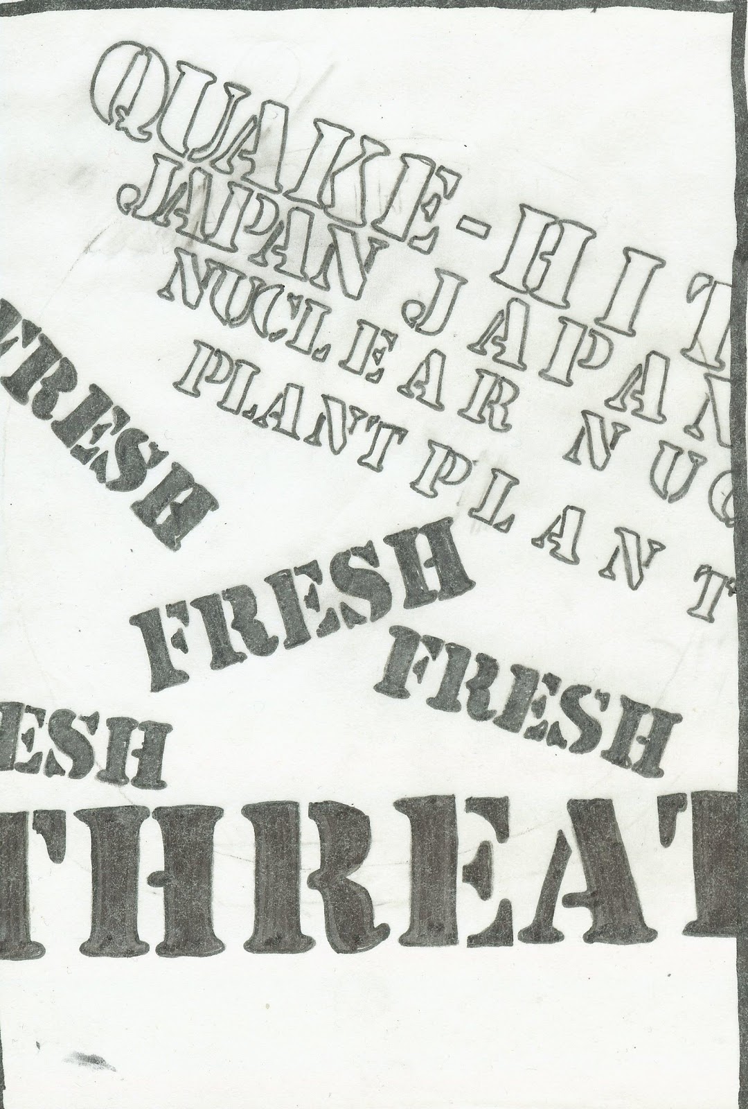
Comp #3
I wanted to show a nuclear symbol while also showing the illusion of movement to be able to make someone see an 'earthquake' had hit. To show this disuption, I made each word slightly to the left or to the right depending on the words that are around it. The reason for the sudden change of font in the middle was because I also wanted to incorporate Japan's dot to show that it is surrounded by the danger made by the Nuclear Plant. I wanted to give it a sense of helplessness so my best way to do this was to just make an outline of it rather than fill it completely in.

Comp #4
This is the continuation of the symbols and the last of them. I wanted to make a flag that was slightly tilted to show that something had hit it to make it that way. The words 'JAPAN' creates the flag that is flying in a very strong wind of opposition. I wanted to incorporate the same symbol from above only to show it now in a flag that is strongly standing up regardless of what is going on around it.

Comp #5
For this comp, I wanted to show what it is like AFTER an earthquake had hit. The bold letters are meant to show the dangerous objects while 'japan' is meant to show the civilians; some may be injured and some may even be dead, but regardless of the condition - it will NEVER be the same for them again.
Comp #6
The group of words that are outlined is meant to show a building that is tilting where the end of it touching the side of the border is slowly crumbling apart. The words that are in bold are the reason for this building breaking apart.

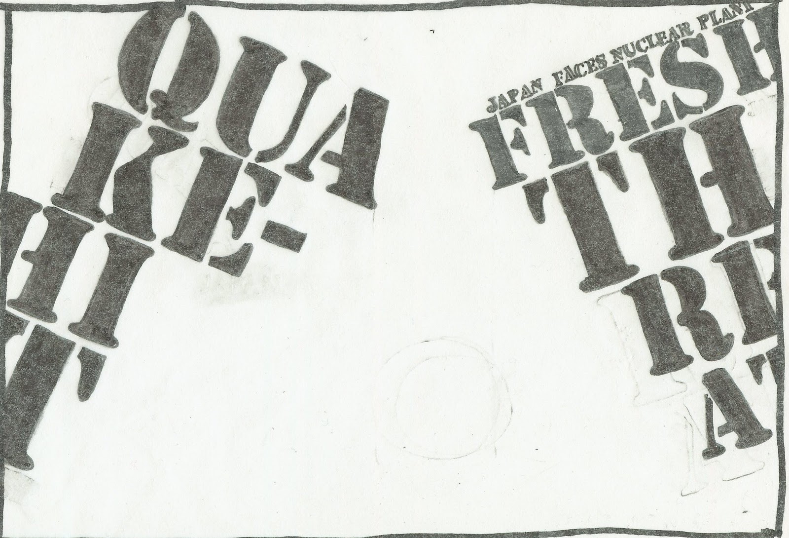
Comp #7
For this, I was aiming for a headline which is 'Quake-Hit' while on the bottom is an unstable building. Just like Jenga, it is about to fall because it cannot support itself. I tilted the words to make the 'building' seem even more disrupted.
Comp #8
For this, I wanted to make a similar comp to the one above only this time I wanted to make two buldings about to collide into each other in the middle. I believe that the placement of the outlined words is effective due to it continuing the sentence and it makes the height of the buildings equal.

Comp #9
For this, I wanted to draw something erupting. To be able to do this, I created the object from words straightened in a line while just making them outlined so that not too much attention is drawn there. I then wrote the words THREAT which is errupting and in bold because that is what happens when something is errupting; everything around it is in danger.

Comp #10
For this, I wanted to make a tribute to all the men that are giving their lives for the sake of the people that they love. Regardless of what career they have (fireman/nuclear power worker), they still are a life. I wanted to make a man stand by a nuclear plant that is saluting to his nation while thinking of the love of his life that he will most likely never be able to see again.
For this, I wanted to make a tribute to all the men that are giving their lives for the sake of the people that they love. Regardless of what career they have (fireman/nuclear power worker), they still are a life. I wanted to make a man stand by a nuclear plant that is saluting to his nation while thinking of the love of his life that he will most likely never be able to see again.
I like number #3 , #5 mainly.
ReplyDeleteI like #3 for the how it goes into the center of the page with the circle and the circle has Japan written in it over and over again. It could maybe be a bit tighter though maybe. That may work to get a better feel.
#5 I like the movement and how it feels. It gives the feel of the earthquake itself rather.
#7 is really interesting. It delivers the message you are trying present. keep it up man.
ReplyDeletei like the idea of #9. its understandable and visually appealing.
ReplyDeletei like the bottom one. it looks like a person surrounded by all the words that look like a bomb. i like the on on the top aswell. it looks like a bird getting ready to fly.
ReplyDelete#9, #3 are pretty cool.
ReplyDeleteComp. #6 works, since it's like a caution sign. Definitely threatening.
ReplyDeleteGREAT COMPS!! NOW WHERE ARE YOUR FINALS?
ReplyDeletewere having a bit of a struggle with it but you did get there, just need a bit more adjusting. They look good on your blog but would like to discuss them when you are going through the design process
Design 1: There is an overall type of pattern. I think the use of repetition reinforces the notion of shifting movement. Now you need to work on the negative space so it is more random. A little to organized, it is the beginning idea and needs to see a few more roughs so that you can really get the type size, negative space and essence of the vibrating quake
Design 2: This is actually a very simple resolution. The letters feel as though they are falling, collapsing together. There is a good use of negative space in the middle. I could very easily see your paragraph of information in smaller type in the bottom. They shapes could be anchored to the ground. Remember Kerning. But I would have liked to see the 2nd word. Your type at the top of the right block is in the wrong typeface too bold and does not mitigate the space between the small type and large words – they do not relate
Presentation: - includes your explanation. Nicholas, you are very good at justifying your ideas and I think that helps your audience and your visualization but it is so badly printed I don’t really want to stay with it.
angela