Pages

Wednesday, April 27, 2011

WOOO! I HATE STAYING UP THIS FREAKING LATE!!!! =_________=


Yeah, I know. I know. =__= I still haven't put my roughs and crap up yet. I'll get to it, don't worry =___= In the mean time, look at my 'pretty' comps. They just 'sparkle' with greatness. =___=
Yeah, I'm going to bed now - see you all in the morning.
SEVEN MORE WEEKS (or something like that)! I AM COUNTING DOWN UNTIL IT'S 'FREEDOM DAY'!

Sunday, April 17, 2011

Roughs For Threat's Headline and Body Para

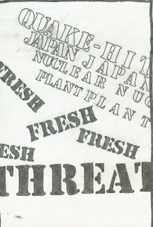
I really hate the new way that Blogger has uploaded images, I preferred it when they would show the actual image rather than html coding. Anyways, these are my roughs. I had left my pencil marks on for a reason to show my rulers and hopefully show my way of thinking rather than put on letters randomly across the page (except I have found that this does work as this shows movement and disorder at the same time, the exact feeling one gets from an impact made by an earthquake)


LIKE A BOSS
 

Wednesday, April 6, 2011

Needed Paragraph For Part III


The message that I am trying to send in my comps will be that an earthquake had hit. Earthquakes cause disruption and cause things to move so nothing will be perfectly in line with each other. Lives were threatened and I will demonstrate this in my work by making some groups of work seem dominated over bigger/bolder font.
To be able to achieve my goal in showing an 'earthquake', I want to...
·       shift the letters.
·       I want to stay away from making the letter too straight or else this will show too much stability.
·       I want to play with the placement of the group of words so that I can show chaos YET I also want to be careful with legibility.
·       The earthquake font is having the stencil typeface
To be able to achieve my goal in showing Japan's powerlessness, I want to...
·       Make some of the words tiny (not microscopic though) because tiny often refers to being weak and suppressed by something much BIGGER
·       I may want the font to be surrounded just to show the same relationship that Japan's people had to deal with; they couldn't escape the havoc
·       I want to give the 'Japan' group of font Maiandra GD since this isn't as bold as Stencil

Monday, April 4, 2011

YOU CAN'T HANDLE DESIGN!

The last video that I will put up for today. This is a spoof, but sadly I don't think that I watched this video.
I actually feel proud though hearing the guy yell at the Prosecutor.
The Few, The Brave, The Designer

Don't Wait - Make People's Eyes Suffocate...NOW!!!

An important insight when doing the last part of the project. Don't make everything HUGE and be smart with the space that you are given. Don't just make random blotches here and there just for the hell of it. That is unless you want it to look like crap =____=

LEAVE ME ALONE!


This might not be funny to all of you, but I am starting to get to this point. And if it isn't funny NOW then watch this five years from now when you are making projects for clients and bosses. THEN you will find this funny because you know her pain. 

I think that this might be what Angela was talking about when she was saying that people focus more on negative critiques rather than giving out positive. They did A LOT of hard work on it and yet people can NEVER seem to be satisfied with what they are given.

Here is one comment about the video and I agree with it completely.

Yup, this is pretty much what you have to deal with if you’re a graphic designer.  Everyone fights over you and your time, the deadlines, and everyone is an expert… except for you, of course.  The individual with the actual design degree.  Despite the crappy acting, this video is worth a couple of chuckles.
And yeah… if you use Comic Sans or Papyrus fonts, you need a serious reality check.

Designer Shirts


Found these all at a Designer blog. If you happen to be interested in buying them then I will give you a link to the place. They have a little more than these, but I tried to pick out the shirts that are specifically geared towards Typography.

As a side note, I never realized that professional designers HATE Papyrus and Comic Sans SO MUCH. I better make a note to myself about that.
DON'T USE COMIC SANS AND PAPYRUS

Roughs

Comp. #1
I wanted to write the letters where they look like buildings. The one on the far left is perfectly straight to show that it is stable and strong, BUT not for long. The reason being is because when you look at the right side, you can see that the other two buildings of text are about to collide against it. For this comp, I really wanted to capture just that feeling of motion in seeing the buildings fall against each other just like dominoes.


Comp #2
My aim was to create a circle of text while boldening the words that are the cause of the problem. The reason for the circle was because Japan's flag is one dot so it was meant to be the flag that has been broken and disrupted. To show disruption, I made sure to tilt the letters all different ways.
Forgive me for the pencil marks, but since this is only a rough I figured that it wouldnt matter too much.

Comp #3
I wanted to show a nuclear symbol while also showing the illusion of movement to be able to make someone see an 'earthquake' had hit. To show this disuption, I made each word slightly to the left or to the right depending on the words that are around it. The reason for the sudden change of font in the middle was because I also wanted to incorporate Japan's dot to show that it is surrounded by the danger made by the Nuclear Plant. I wanted to give it a sense of helplessness so my best way to do this was to just make an outline of it rather than fill it completely in.

Comp #4
This is the continuation of the symbols and the last of them. I wanted to make a flag that was slightly tilted to show that something had hit it to make it that way. The words 'JAPAN' creates the flag that is flying in a very strong wind of opposition. I wanted to incorporate the same symbol from above only to show it now in a flag that is strongly standing up regardless of what is going on around it.

Comp #5
For this comp, I wanted to show what it is like AFTER an earthquake had hit. The bold letters are meant to show the dangerous objects while 'japan' is meant to show the civilians; some may be injured and some may even be dead, but regardless of the condition - it will NEVER be the same for them again.

Comp #6
The group of words that are outlined is meant to show a building that is tilting where the end of it touching the side of the border is slowly crumbling apart. The words that are in bold are the reason for this building breaking apart.

Comp #7
For this, I was aiming for a headline which is 'Quake-Hit' while on the bottom is an unstable building. Just like Jenga, it is about to fall because it cannot support itself. I tilted the words to make the 'building' seem even more disrupted.

Comp #8
For this, I wanted to make a similar comp to the one above only this time I wanted to make two buldings about to collide into each other in the middle. I believe that the placement of the outlined words is effective due to it continuing the sentence and it makes the height of the buildings equal.

Comp #9
For this, I wanted to draw something erupting. To be able to do this, I created the object from words straightened in a line while just making them outlined so that not too much attention is drawn there. I then wrote the words THREAT which is errupting and in bold because that is what happens when something is errupting; everything around it is in danger.

Comp #10
For this, I wanted to make a tribute to all the men that are giving their lives for the sake of the people that they love. Regardless of what career they have (fireman/nuclear power worker), they still are a life. I wanted to make a man stand by a nuclear plant that is saluting to his nation while thinking of the love of his life that he will most likely never be able to see again.


Where's Typo? (Part VI)

Uppercase 'W'
The wings form the outer lines of the 'W' while the head would create the middle line.
Yes, I am into dragons very much (who isn't?). My favorites are the long skinny ones instead of the big bulky fat ones.

'Uppercase' J
This saxaphone is from the anime TRIGUN. Midvalley the Hornfreak (one of the Gung-ho-Guns) would use this as a weapon by using the instrument's loud sound waves. No, it didn't make the opponent go deaf, although I am sure that he could if he wanted to. =.=

'Uppercase' M
This cute little girl was bought at Knott Scary Farm. I also have a STRONG love for gothic/creepy dolls and this guy kind of  fit along those lines. If you are wondering where the 'M' could be in all of this then try looking at the way that his mouth is formed. Yeah, NOW you get the picture.

Uppercase 'I'
Before ANY of you get any wrong ideas here...NO, I am not into little fuzzy bunnies, sparkly rainbows, and crap. THIS was from the anime called 'Bleach'. Whenever a Soul Reaper would want to get out of their physical body, they used this to do so. Inside there are millions of little white pills and each pill lets that body be taken care of by a lesser soul (this helps because the body would be unconscious without a SOUL to control it)